%20(1).png)
8 Baby Sprinkle Invitations So Adorable Guests Will RSVP Twice
Updated: Dec 18, 2024
Planning a baby sprinkle? Lucky you! A sprinkle is the perfect low-key celebration for a second (or third) baby, and it deserves seriously cute invitations. Whether you’re into whimsical clouds, sprinkle-covered donuts, or chic florals, we’ve rounded up 8 adorable baby sprinkle invitations that’ll set the perfect tone for your event. Trust us, your guests will be ready to RSVP the second they see these beauties.




Let’s dive in:
8 Baby Sprinkle Invitations for Every Style and Theme
1. Mint Green Umbrella Baby Sprinkle Invitation
This adorable baby sprinkle invitation features a mint green umbrella with pink and blue hearts gently raining down—a sweet nod to the sprinkle theme. Its clean, modern design is perfect for a gender-neutral celebration, keeping things simple, stylish, and totally on point.
Why It’s Perfect:
Mint green umbrella with charming heart details
Perfect for gender-neutral or traditional sprinkles
Simple, modern design for a clean and elegant look
Where to Get It: Sprinkle with Love - Greetings Island

2. Twinkle, Twinkle Little Sprinkle Invitation
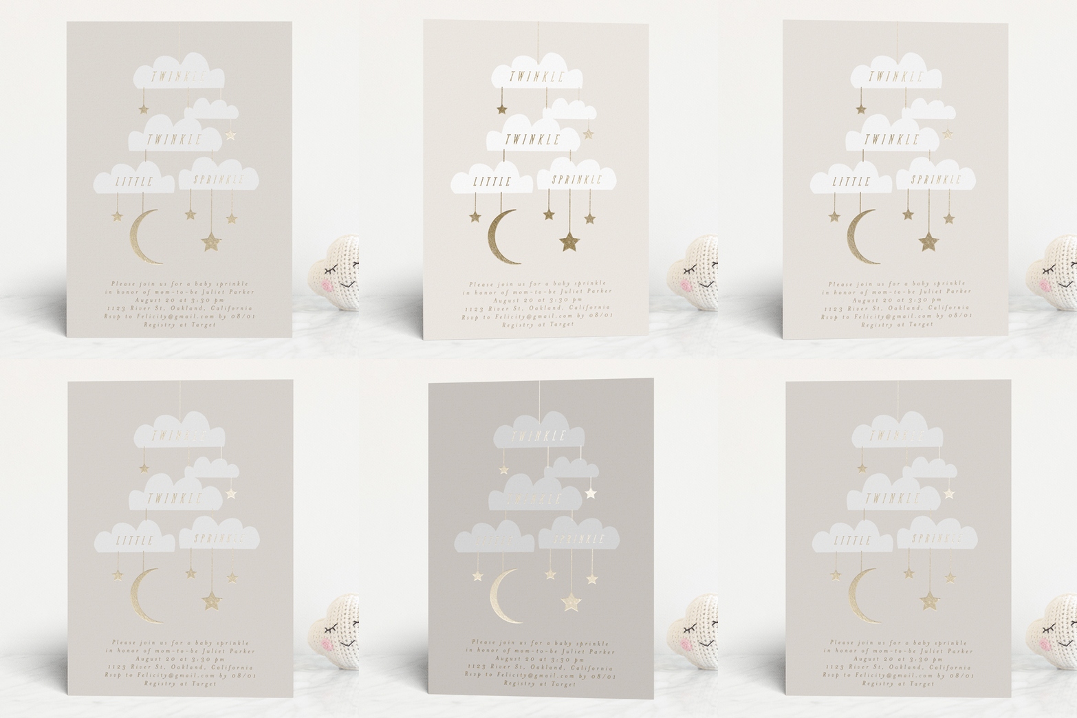
For a gender-neutral sprinkle, this twinkle-themed invite is pure magic. Featuring clouds, stars, and a crescent moon, it’s dreamy, elegant, and soft—like a lullaby in invitation form. Pair it with matching envelopes for a fully polished look.
Why It’s Perfect:
Neutral design suits any baby sprinkle
Minimalist yet whimsical vibe
Perfect for evening or "Twinkle Little Star" themes
Where to Grab It: Bougie Baby Sprinkle - Minted

3. Sprinkled Donut Baby Sprinkle Invitation
“Sprinkled with Love” takes on a literal meaning with this delightful donut-themed invitation. Featuring pastel donuts covered in sprinkles, this design sets the stage for a fun and lighthearted sprinkle celebration. Bonus points if donuts are on the menu!
Why It’s Perfect:
Whimsical and sweet design
Perfect for brunch sprinkles or donut-themed events
A crowd-pleaser for moms who love a playful touch
Where to Shop: Editable Donut Sprinkle - Etsy

4. Sweet Floral Umbrella Invitation
This stunning invitation screams "spring chic" with its soft watercolor florals and a golden yellow umbrella. Perfect for a garden-inspired sprinkle or a mom who loves a little sunshine. The hand-lettered script adds a sophisticated touch that’ll charm your guests instantly.
Why It’s Perfect:
Gorgeous floral artwork
A soft, inviting color palette
Ideal for spring or botanical-themed sprinkles
Link Me Up: Shady Baby Sprinkle - Greetings Island

5. Jungle Animal Baby Sprinkle Invitation
Calling all wild hearts! This jungle-themed baby sprinkle invitation is perfect for animal lovers. Featuring a giraffe, lion, zebra, and elephant in adorable watercolor style, it’s playful yet classy. The lush greenery ties the design together beautifully.
Why It’s Perfect:
Perfect for safari or animal-themed sprinkles
Gender-neutral with soft, earthy tones
Ideal for families welcoming a little adventurer
Buy It Here: Safari Baby Sprinkle - Zazzle.

6. Popsicle Sprinkle Invitation
This pink popsicle invitation is as sweet as it gets! With soft stripes and colorful sprinkles, it’s perfect for a summer baby sprinkle or a “girl on the way” celebration. The design is fresh, fun, and oh-so-adorable.
Why It’s Perfect:
Playful, summer-ready design
Perfect for celebrating a baby girl
Adds a pop of color to your event
Where It’s At: Popsicle Baby Sprinkle - Greetings Island

7. Colorful Confetti Baby Sprinkle Invitation
This vibrant baby sprinkle invitation features playful confetti dots in yellow, pink, and purple, paired with elegant, modern typography. Perfect for a fun, cheerful celebration, this design adds a festive touch while keeping it classy and stylish.
Why It’s Perfect:
Bright and colorful confetti theme
Modern and elegant script font
Great for gender-neutral or joyful sprinkles
Snag It Here: Simple Baby Sprinkle - Printsbery

8. Sprinkle-Themed Digital Invitation
Sprinkles, sprinkles everywhere! This digital invitation is framed with colorful sprinkles and paired with a matching pink envelope liner. It’s perfect for a sprinkle in every sense of the word—simple, fun, and totally on theme.
Why It’s Perfect:
Digital and eco-friendly
Colorful and festive sprinkle border
Great for last-minute planning
Slide Into These DMs: Punchbowl Baby Sprinkle - Free Designs

Nail the Wording: Here are a few cheeky examples to get you started:
"Twinkle, twinkle, it’s a sprinkle!"Join us to celebrate [Mama’s Name] and Baby # 2 (the grand finale is TBD).Date: Saturday, March 21st, 2 PMLocation: [Venue]RSVP by March 10th—because we actually need to know who’s coming.
"We’re sprinkling baby # 2 with love (and wine for the guests)."Date: Sunday, April 10thLocation: [Venue Name]Bring yourself, your vibes, and maybe a gift or two if you’re feeling generous.
"Another bun in the oven—let’s toast to chaos, diapers, and a new sibling who’s gonna need therapy later."RSVP to [Host’s Contact Info] before the deadline (or don’t, but it’ll make life harder for us).
Quick Tips for Pulling Off the Perfect Baby Sprinkle
Lean Into the Theme: Match your invites to your decor, whether it’s boho-chic, donut brunch, or "we threw this together last minute."
Keep It Short and Sweet: This is a sprinkle, not a wedding. A two-hour event is plenty.
Don’t Forget a Registry: Because let’s be real—this sprinkle isn’t just for vibes; it’s for the diapers.
With these invites and tips, you’re ready to sprinkle like the stylish, savvy host you are.


https://qq88.fun/ hôm trước mình thấy bạn bè nhắc nên bấm vào xem thử cho biết, chủ yếu coi giao diện chứ không có ngồi tìm hiểu sâu. Vào cái là thấy trang làm khá “dễ thở”, nền nhìn thoáng và các khối nội dung tách ra rõ nên mắt không bị loạn. Mình thích nhất là thanh menu đặt ngay chỗ dễ thấy, bấm qua lại mấy mục nhanh gọn, không phải kéo lên kéo xuống nhiều. Mấy phần thông tin cũng trình bày theo kiểu cột gọn gàng, chữ không bị sít quá nên đọc lướt ổn. Nói chung cảm giác họ ưu tiên cho người vào xem nhanh, nhìn phát nắm được bố cục, nhất là cách chia…
Mình từng mất khá nhiều thời gian lọc addon cho Minecraft PE rồi mới dám ghép thêm resource pack để cài vào máy. Nhờ theo dõi mấy bản shader nhẹ cho máy yếu với các map mới, mình thấy việc xây thế giới đỡ nhàm và có thêm nhiều ý tưởng hơn. Thường thì mọi người trong cộng đồng hay nhắc tới các addon kiểu furniture, alien invasion, kèm theo đánh giá sao để dễ chọn cái ổn. Mình cũng không tải theo lời đồn, mà ưu tiên chỗ nào cập nhật đều để khỏi gặp bản lỗi. Hôm trước mình có ghé https://thuvienmc.com/ để tìm addon, shader pack và map miễn phí, thấy tiện vì gom được nhiều thứ…
Trang chủ Hi88 mình vừa lướt thử cho biết thôi, tại thấy bạn bè nhắc nên tò mò giao diện ra sao. Mình không có ngồi tìm hiểu sâu hay bấm lung tung nhiều, chủ yếu kéo lên kéo xuống xem bố cục có dễ chịu không. Cảm giác đầu tiên là trang nhìn khá thoáng, kiểu chia nội dung thành từng khối nên mắt không bị rối khi đọc nhanh. Mình cũng để ý cái menu điều hướng đặt khá dễ thấy, chuyển qua lại mấy mục không phải mò lâu. Chữ với khoảng cách dòng nhìn ổn, không bị dày đặc như một số trang khác nên lướt vài phút vẫn thấy nhẹ nhàng. Nói chung trải nghiệm…
Mỗi lần định soi cầu xsmb, mình thường ngồi xem lại kết quả mấy kỳ gần đây trước đã, kiểu để đầu óc bớt bị cảm xúc chi phối. Từ ngày chịu khó theo dõi dự đoán xổ số miền Bắc đều đều và tự ghi lại vài thống kê tần suất, mình thấy việc chọn số có cơ sở hơn hẳn. Thỉnh thoảng mình còn vào ketqua2.net để đối chiếu lại các kỳ trước cho yên tâm, chứ không chỉ nghe người ta truyền miệng. Trong nhóm mình tham gia, nhiều người cũng khuyên nên kết hợp dữ liệu lịch sử với mấy công cụ tạo dàn số, lô xiên để nhìn ra xu hướng. Nói chung muốn dự…
Ngày nào mình cũng tranh thủ lướt vài tin về bitcoin để xem thị trường đang nghiêng hướng nào, rồi đọc thêm mấy nhận định phân tích kỹ thuật cho đỡ mù mờ. Nhiều lúc chỉ một mẩu tin nhỏ thôi mà giá đã quay xe, nên mình hay xem cả dự đoán giá bitcoin lẫn cập nhật altcoin với memecoin trước khi tính chuyện vào lệnh. Mình thấy nhiều người trong cộng đồng cũng chuộng mấy bài on-chain và tin vắn kiểu dựa dữ liệu, nên thỉnh thoảng mình ghé tapchibitcoin.io để tham khảo nhanh. Với các đồng lớn như ETH, XRP hay SOL thì mình không dám đoán theo cảm giác, phải gom nhiều yếu tố lại mới…